Showing posts with label art. Show all posts

Monday, July 14, 2014

OT11: The Monk and the Hangman’s Daughter

In honour of Germany winning the 2014 Fifa World Cup (despite me backing France), I’ve decided to break out one of the most amazing books I’ve ever picked up from The Monkey’s Paw – a rare translation of a German story.

Teutonic design.

A case to protect the case

Don't foresee a Disney adaptation coming anytime soon.

The Monk and the Hangman’s Daughter is an 1891 novella by German novelist Richard Voss. In 1892, it was translated by Adolphe De Castro who then contacted one of the most interesting literary giants to edit and adapt it – Ambrose Bierce. Ambrose Bierce ranks quite higher on the list of writers I revere. In addition to being a crazy literary critic, having a distinctively dark writing style, and authoring of the greatest short stories of all time, the guy up and disappeared without a trace one. No one knows what happened to him, only that he joined Pancho Villa’s army and apparently felt that that wasn’t interesting enough so he left for an unknown destination after. He was 71.

Five artists on one page.

This 1967 printing of The Monk and the Hangman’s Daughter is a private printing created with an extremely high attention to detail for The Limited Editions Club. Coming with a slipcover that fits into a slipcase, on the shelf it looks like a simple cardbound book. However, the actual book inside the casings is bound in burlap with embossed lettering and symbols.

This photo really doesn't do it justice.

People went into battle with less armour than this in those days.

While the book seems like an archival edition that you would expect to contain no-nonsense black and white text in minimalist fashion, as soon as you open it, you are blasted with an explosion of vivid colours. Containing seven watercolour illustrations by Michel Ciry, it is a gorgeous read through and through. 

Just like a storybook.

Pretty.

Begins well enough.

Minor setback, right?

Just like a German storybook, anyway. Spoiler alert.

It’s not often that one finds a book that engages the senses so well and I’m very fortunate to have snapped this up before someone else did. Apparently it belonged to a notable film/television personality but I can’t for the life of me remember who it was since I was too busy running my hands across the cover when Stephen was telling me about it. Burlap really does make an incredible binding.

Monday, March 3, 2014

OT4: Men of Canada

Stephen Fowler, the proprietor of the Monkey’s Paw, currently has an art piece exhibiting at the 26 art space centering around a set of old books, so of course I went to check it out.

The forefathers of our country?

Without giving too much away, this multimedia exhibit stems from a set of anthologies titled “Men of Canada” dating from the late 1800’s which was not unlike a giant yearbook for distinguished men of the Dominion. 

Does not highlight how thick these books were.

Pairing carefully extracted photographs and one-line bios taken out of context (one of my favourite things to do) with an original score, it’s an entertaining look at the upper society men of our great country a century and a half ago. It’s okay to laugh.  

Who doesn't love logic like that?

The whole piece is only 12 minutes long and runs on repeat cycling through five categories. I found myself sitting through multiple times out of fascination, and partly because I don't know why I was so amused by the poor guy who became distinguished by losing everything in a fire.

I know, I'm a terrible person.

The books themselves were also on display and the covers were simply gorgeous.

Design principles in the 1800's.

There's also method to the madness of how the categories were organized. It becomes pretty clear early on if you like to judge people like I do, otherwise you might need a second viewing.

The face of justice.

“Men of Canada” will be playing continuously for the next three Saturdays at the 26 art space at

26 Mackenzie Crescent (a block or so from the Monkey's Paw) from 2-6pm. If you like old-timey photos and quirky facial hair, go check it out.


Monday, January 27, 2014

Submission 1: The Crackerjack Book for Boys

It is my pleasure to present the first Biblio-Mat submission:

Book: The Crackerjack Book for Boys
Submitted by: Haze Kwok

Does it come with a popcorn prize?

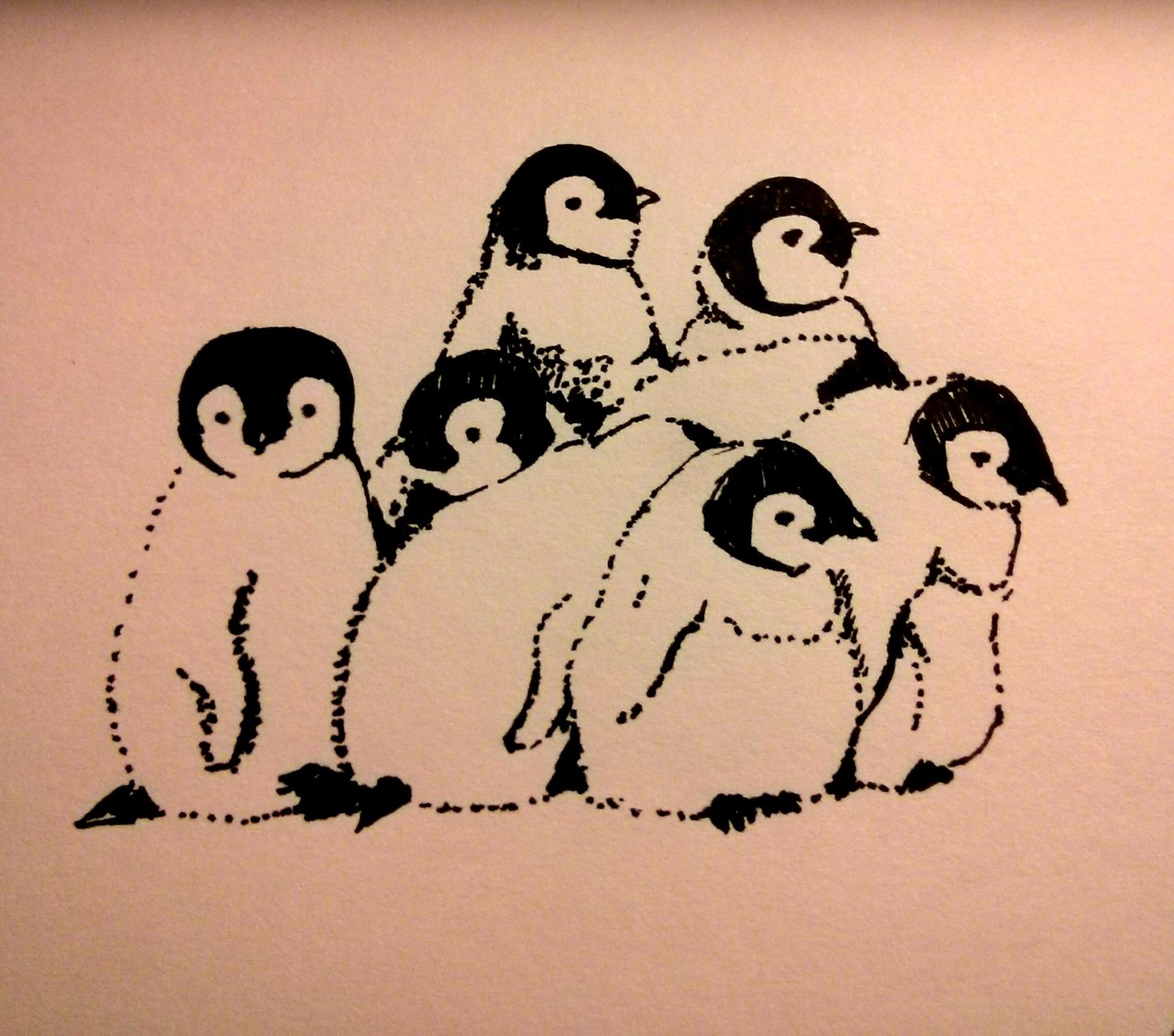
The very talented Haze Kwok received The Crackerjack Book for Boys from the Biblio-Mat during the Biblio-Mat Fanatic Day and decided to do something artistic for it! Using the quote of “He glanced back at the swaying camel team” from the book, she decided to bring the scene to life with an ink drawing:

Who doesn't like camels?

As you may recall, one of the best books I’ve ever gotten from the Biblio-Mat was Camels!! so these animals have a dear place on this blog.

This blog started off as a crazy undertaking to read a book a week. Well, Haze’s project is even more ambitious – she’s doing a new drawing every day and documenting her progress on her tumblr. I’ve been following it since the beginning and it’s amazing how fast her talents are evolving. The progression from pencil sketching to ink has been mind-blowingly. Check it out!

http://hazeyk.tumblr.com/post/73029040568/daily-draw-63-a-pile-of-baby-penguins
Who doesn't like penguins??

http://hazeyk.tumblr.com/post/67269601305/daily-draw-54-t-rex-goes-shopping
Who doesn't like t-rex shopping??!

Hoping to have more submissions come in so send in your Biblio-Mat book pics to submit@therandombookmachine.com.

Tuesday, December 31, 2013

W52: Catalogue of the Books, Manuscripts, Works of Art, Antiquities and Relics Exhibited in Shakespeare’s Birthplace

As the final book of this year long project, I feel there is something symbolic about this week’s Biblio-Mat piece.

Even the acronym
Despite having the longest title of any Biblio-Mat book thus far, Catalogue of the Books, Manuscripts, Works of Art, Antiquities and Relics Exhibited in Shakespeare’s Birthplace was actually a simple book compiled by Frederick C. Wellstood. With a grey paperbound cover bearing a black and white seal stating that it was published by the Trustees and Guardians of Shakespeare’s Birthplace, the 164 page book was in great condition considering it was published in 1925.

Welcome to Cribs - circa 1500's.
CotBMWoAAaREiSB was a fitting end to this year. It encapsulated the great range of feelings experienced through the year-long project with the wonderment of literary history and book-related antiquities representing the best of times and Shakespeare on the other end of the spectrum. Yep, still not a fan of the guy’s plays. Fortunately, this book was less about his works and more about his life and the world surrounding him.

The first thought upon looking at this book was that it would be a long read since catalogues generally did not exude thrills and excitement, not even when it’s music related. CotBMWoAAaREiSB, though, was actually more of a history book on Shakespeare than a traditional catalogue. True to its name, the book did seem to list every single item in the house that Shakespeare was born in, but instead of just simply listing the objects, the book has a blurb about each entry describing the item and giving a short history about it.

Not always useful history, but history nonetheless.
While there were a bunch of images scattered throughout, the majority of the catalog entries did not have accompanying photographs, which was terrible since they seem to have been written to be paired with visuals. Referencing different attributes of the items made it a frustrating read at times as curiosity was baited without any payoff. It was like walking through an exhibit where all the items were stolen and all that were left were the information labels describing the things that made the objects interesting. Perhaps it was an elaborate ploy to force readers to actually visit the birthplace.
Actually a ballin' house.
Leading with a floor plan of the house, the book combed through every inch of the birthplace, room by room. Funny enough, the first few pages of entries were on items placed there well after Shakespeare’s time – portraits of Shakespeare historians, playbills of his plays from much later performances, and a bill of sale of the house that ultimately placed it in the hands of the Trustees. Seeing how his birthplace is now a museum, there were a lot of these types of entries in the book.
Also, maces. Lots of maces.
Moving further into the house, the focus turned to household items. While it was unclear if the pots, pans, and other fireplace paraphernalia were actually used by the Shakespeare family or just reproductions, the entries did describe how each item was used by the people of the time. After the kitchen section, I now feel confident in my ability to cook a meal properly if I ever find myself stranded in the 1500’s.

Also my ability to build a school desk.
It wasn’t until the book got to the Inner Room of the ground floor that we are presented actual items from Shakespeare’s life. Being the house that Shakespeare was born in, there were a lot of documents surrounding his parents, John and Mary. With items ranging from the bill of sale of the house to John to notices of petty fines, it was surprising that this much documentation survived intact all these years since they were from before William was born. It was like they knew their son would grow up to be the most famous writer of all time so they kept all the paperwork they ever encountered to document his heritage. Or maybe they were just hoarders.

Shakyspre?
The later parts of the book became more like a traditional catalogue as they reach the museum portion of the house. With random relics from the period, the objects strayed away from William Shakespeare and more towards general society in the 1500’s. The entries on the documents also jumped back and forth between Shakespeare and works by other authors and playwrights, which were sometimes tied together but mostly placed in the museum to break the monotony, or so I would assume.

Not pictured: The Art of Spelling.
As the final book of this year, it was a respectable read and tied up the project in a nice way as this blog itself is like a partial catalogue to the Biblio-Mat. And since I already used the clip of Blackadderpunching Shakespeare in the face, I will end on this clip instead:


Book rating: 8/10 (Interesting but not very entertaining)

Random quote: “dated April 29, 1552, recording that Humfrey Reynolds, Adrian Quyney and John Shakysper, were fined 12d. each for having made a dirt heap (sterquinarium) in Henley Street.” (Can’t even make this stuff up)

Signing off on 2013, I think I’ll post a recap of the year in the next few days once my weary eyes have rested.

Monday, October 28, 2013

W43: The Carver’s Companion

This week’s Biblio-Mat offering came out of the machine with a quiet thunk. Being thin and wide, I was hoping for a book of illustrations but received a tome of crafts.

Meta.
Published in 1958, The Carver’s Companion was a book on carving wood and stone by Peter Morton. With a brown non-descript cloth cover, the book very much resembled a piece of wood with a small oak leaf engraved on it. At 70 pages, it was one of the shortest books I’ve received from the Biblio-Mat, but felt much thicker due to the 46 unnumbered photo plates pages spaced throughout.

Also a lot of in-text illustrations.
The Carver’s Companion began with an introduction into the art of woodcarving. Interestingly enough, it focused on the two branching paths of apprenticeship versus art school with arguments that could be applied to many fields of study. Through apprenticeship there was more hands on practice but one would be limited to making the products the shop produces. While boring, it did eventually allow you to master a task completely and utterly. The path of art school, though, contained more theory and explored a wide range of mediums and styles but never focuses on anything long enough to be proficient at it. Seeing how the examples of the greatest carvers given all started as apprentices, the book was clearly leaning towards the side of learning through doing.

Most artsy fruit bowl ever.
From there, the book opens up into the actual craft of carving. Listing the tools required, which were a lot, it jumped right into exercises to practice the art of woodcarving. This pretty much amounted to buying planks of wood and learning how to gouge straight lines, curved lines, and intersecting lines into the wood. Once that was practiced enough came the next steps of carving block letters.

I own nothing that remotely like this. (This will be important later)
Surprisingly, the next section after these basic exercises focused on the importance of taste and design. With more focus on composition, the information provided didn’t actually teach design as much as implant the notion of its importance. Aspiring stone carvers were also told that they’ll need to become woodcarvers first as the disciplines build upon the shared principles of basic carving.

Carving made easy: Find a block of stone, then chip away anything that doesn't look like a man.
Moving onto furniture carving, it became apparent that this book wasn’t as much a how-to guide as it was a how-should guide. With the bulk of the lessons basically revolving around practicing and studying how the works of master carvers were created, it was less than useful to the carver looking for instruction. Thankfully, the Roman lettering section included picture guides that at least showed you what the final work should aspire to be like.

Basically: Keep practicing until it looks like this.
Ending on material selection and restoration, I felt that much of the important parts of carving, such as techniques, planning, and more importantly, mistake covering up, were eschewed for historical analysis of famous works, which was funny given the emphasis on apprenticeship over art school at the beginning.

Of course, that didn’t stop the grand tradition of participating whenever an arts and crafts book comes out of the random book machine. A quick trip to Home Depot resulted in a small plank of wood and a box cutter as buying a hundred dollar set of wood carving tools I would only use once was only a slightly worst idea than cutting down a random tree in the middle of the city for carving material. The result was less than satisfactory.

Yep, that's wood alright.
Even in high school I knew that woodwork was not for me, placing far below cooking, metalwork, and sewing. With that in mind, I went for an easy design – the Biblio-Mat. After all, rectangles meant easier straight cuts, which were simple enough, until the $2.50 nature of the wood reared its head and started splintering. Now I understand the desire for endangered exotic hardwood as the splintery texture of homegrown pine sucks for the delicate art of box cutter carving.
Two hours not very well spent.
I think I’ll stick to needlepoint.


Book rating: 5/10 (Interesting subject, bad follow through)

Random quote: “But the beginner should not be too kind to his hands and too harsh to his pocket.” (So true in almost every new hobby)

Wednesday, October 16, 2013

W41: Cathedral Cities of Spain

This week’s blog post comes a couple days late on account of me taking a trip and not packing a laptop due to the Biblio-Mat spitting this out:

Yep, that's a quarter.
Published in 1909, Cathedral Cities of Spain was 347 deckle edge pages long and weighed a good four pounds. With gilded lettering on a dark red embossed cloth cover, it had a regal beauty to it that continued into the interior with red and black all caps typeface on the title page that set the tone for the rest of the book. 

Pretty.
Interestingly enough, the author, W. W. Collins, R.I, also illustrated all the remarkably beautiful plates inside. Upon researching him further, it turns out that William Wiehe Collins was actually a landscape painter, which makes it all the more impressive that he somehow managed to fill three hundred odd pages with words.

Worth at least a couple thousand.
My first thought when I picked up this book fell somewhere along the lines of ‘Cathedral Cities of Spain? Isn’t that pretty much all of them?’. My second thought was on how much it looked like a gothic phone directory. Luckily, my week consisted of going to Chicago to run the marathon, which meant two days of sitting on a balcony doing absolutely zero physical activity to rest up for the race, so there was actually ample time to delve through the tome on this trip.

Really, how many non-Cathedral cities are there?
For a 104-year-old book, this copy of Cathedral Cities of Spain held up remarkably well. Binding was tight and pages were still white and flexible. Most surprising, though, was that it included sixty plates reproducing Collins’ watercolour paintings of the cathedrals in full colour. Considering most of the newer books I’ve received from the Biblio-Mat only contained black and white images, this was impressively decadent. There were also a number of unopened pages that made reading difficult but I did not have the heart to slice them apart seeing how they survived a century in this state.

The deckle edges were legit.
The book itself was a very straightforward guide to all the big cathedrals in Spain, broken down into twenty-four cities. Speaking of each city as if it was a past lover and an old friend, Collins evoked a romantic feel into every location in the journey, whether it was a grand hub of commerce or a fishing town. However, he never shied away from discussing the negative aspects of each city either, pointing out bleakness and boredom in some areas and rampant poverty and begging in the streets of others. It was a refreshingly honest perspective that is seldom seen in travel books, oh like, say The English Lake District.

If you squint it looks like a Monet. Then again, so does everything else.
 Devoting an average of twelve pages per city, Cathedral Cities of Spain felt like a whirlwind tour of the country that was efficient yet satisfying. Each chapter contained a quick anecdote about Collins’ journey and a brief history of some notable events that happened there before launching full force into describing the cathedral scene. For the first few chapters this description was limited to how the buildings looked but as he travelled deeper and deeper into cathedral country he became more and more immersed in what the cathedrals contained.

More often than not: dead bodies.
In some instances, such as the Alhambra in Granada, not only was he was able to journey down into the crypts to see the tombs of kings and queens from another era, but also allowed to go through relics that the average visitor would probably never hear about, let alone see. It was truly an exploration into the history and culture of these cathedrals that felt like I was there uncovering the past with him.  

Who needs photos when you have immaculate watercolours?
Inspired by this, I decided to explore the cathedrals of Chicago, a city known for its architecture, and document my own historical findings. Unfortunately, it turns out that running 42 kilometers straight does terrible things to one’s ability to ascend and descend stairs so I gave up after reaching St. James Cathedral. However, I did make a visit to the very close by and very street level Chicago Tribune Tower, which contains numerous fragments of temples and cathedrals from across the world. Rubbing them is almost the same as visiting them right?

Not so forbidden now, eh?

Book rating: 7/10 (Bonus point for being ancient)

Random quote: “Next to it hangs Ferdinand’s sword, with a remarkably small handle. I had thought from the kneeling effigy in the Capilla Real, that both he and Isabella must have been “small made” and this verified my guess.” (Turn of the century PC?)

Monday, September 2, 2013

W35: The Driftwood Book

When I walked into the Monkey’s Paw this week I noticed a familiar book on one of the tables:
So we meet again...
As you might recall, a few weeks ago I had received a book called Wood’s Natural History and jokingly remarked that I was worried theBiblio-Mat had given me a book about wood, since the very subject just screams awe and excitement. With that at the back of my mind, I put my two dollars into the machine only to have it pop out this:

Popular enough for a second round.
Printed in 1966, The Driftwood Book by Mary E. Thompson had a nice retro feel to it from the cover design to the interior layouts and paper quality. Filled with over a hundred and sixty photographs, it was quite a visual book. Sadly, outside of the vibrant dustjacket, the interior 244 pages were all black and white, even though the descriptions below the photos pointed out the colour schemes and pairings that make the piece work.

Either that or I'm selectively colourblind.
The Driftwood Book started off with a foreword that talked about the art of driftwood arranging but somehow switched to the importance of having an amazing photographer halfway through, which was a bad sign not unlike a cookbook talking about how to make the pictures look good more than the actual preparation of food itself.
 
The first section covered how one would obtain the driftwood, followed by the preparation of the wood, then the art of creating a piece, and finally accenting it with other elements. For a book that marketed itself as a tutorial book, though, there was very little instruction given on how to actually arrange pieces. 

Every other piece had small Chinese figures.
There were a few bits on design theory as well as current trends and creative freedoms but it was greatly lacking on how to actually build a piece. Focusing on the photos of the author’s work, The Driftwood Book seemed to believe in case studies more than exercises. That or the author just wanted a platform to showcase her work.

Captures the essence of the abandoned lot.
Nonetheless, I decided to follow the information in the book to create my own piece of driftwood art, section by section.

Part 1 – Acquiring the driftwood

According to the book, the best places to find good driftwood were ocean beaches. Living in Ontario, this was not an option. The book described lakes as decent sources, but only in late fall or early winter due to water conditions. It also advocated sawing and hacking off interesting looking exposed tree roots, which I feel is against the spirit of “driftwood” art, and environmental conservation for that matter.

After walking up and down the beach at Polson Pier, I realized the pickings were slim at best. There were a lot of branches and logs but not a lot of driftwood and definitely none of the interestingly shaped ones shown in the book. I ended up picking up the least slime-covered piece that wasn’t harbouring parasites. Extremely lightweight with a patina that could be best described as dirt-covered, I settled with the notion that it looked like it could have one-time been in the water. In hindsight I should have gone to the island.


Then again, “getting wood” has a different interpretation on the island.
Part 2 – Preparation

The preparation phase was a bit easier. Soap, warm water, and an old toothbrush cleaned up the driftwood along with other pieces of materials that was picked up at the beach – a piece of brick and some clippings shrubbery by the beach. Using a utility knife, I followed the book’s instructions of trimming away all the parts of the wood that didn’t look like art.

The piece of brick surprisingly turned out to be red after washing.
Part 3 – Assembly

In this section, The Driftwood Book provided guidelines on: 

Framework: The piece should flow with the shape of the driftwood.
Scale, proportion, balance: The elements used should not look out of place.
Use of different materials: Should compliment or contrast without clashing.
Accessories: Figures are good. Chinese figures are better.

As the book suggests, I tried two different setups. The first arrangement:

Figure 1.
For this piece, I wanted to capture the seemingly unnatural lines that occur in nature as this piece of driftwood had a grain that ran almost ruler straight. Flanked by the red man-made brick and the still green unmodified branches, the lightly trimmed driftwood bridges the two aspects of nature that are constantly at odds with each other - man versus wild. The slight tilt upwards symbolizes progress in that the more we build the further away we move from the land.

The second arrangement:

Figure 2.
I just wanted to use the Thor figure.


Book rating: 5/10 (Not that useful or pretty)

Random quote: “I have found three things to be most pertinent to the art of flower arranging, and especially to driftwood arranging. They are creative imagination, courage and freedom of expression.” (1 and 3 are related, 2 not so much)