Monday, March 31, 2014

S8: Lightnin’

At first this Biblio-Mat book looked like a run of the mill biography but it turns out to be much more interesting.

The nickname is a bit of a misnomer. Really.
Title: Lightnin’

The cover itself gives away an air of vintage – not quite antiquarian, but distinctively dated in a charming way. Indeed it was published in 1920, and on thick stock with a photo cover to boot. Written by Frank Bacon, Lightnin’ had more than meets the eye.

$1.75 is steep!

Mmmmm...bacon...

The Biblio-Mat doesn’t give out fiction often, so when it does it’s always interesting. Lightnin’, as it turns out, is a fictional biography based on Lightnin’ Bill Jones, the eponymous character from Bacon and Winchell Smith’s play “Lightnin’”, a crafty old man in the not-so-wild west. 

Reading through the first chapter, it seems to be farcical view on small town life, but really, anything written back then seems like a farcical view of small town life. The best part of this book is the inclusion of photographs from the stage play.

It must've been extremely successful.

See, total misnomer.

Also interesting is back inner flap of the dustjacket. Not only does it have an ad for Harper’s Magazine (only $4.00 a year!) but it also has an unclipped book re-ordering coupon, which I rarely see.  

Tempted to mail it to the publisher.

Perhaps one day I'll end up reading through the whole thing but for the time being, this lightning will stay bottled on the shelf.

Monday, March 24, 2014

S7: Beaten Tracks

In the midst of planning a trip to the other side of the world, this Biblio-Mat book looked like it could give me some springboards on places to go. Unfortunately, it turned out to be completely useless for my purposes.

At least the cover is nic- oh wait...

Title: Beaten Tracks

Written by J. H. MacCallum Scott and published in 1938, Beaten Tracks is a travel book that looks very much like most travel books I’ve received from the Biblio-Mat.

Quite beaten indeed.

Looking through the table of contents, it seems quite fitting that the title of Beaten Tracks is missing the ‘Off the’ before it as the text covers the author’s travels to Canada, USA, Mexico, Brazil, New Zealand, and Australia, which may be among the most popular destinations today. Sadly, it doesn’t travel through Europe or Asia, which might have actually helped in my trip planning.

At least the photos were well done.

Despite looking quite generic, though, Beaten Tracks does have two interesting qualities about it. The first was the inner cover, which has a pretty fancy bookplate denoting that it comes from the library of Homer Morton Jaquays, who appears to have been a soldier of note.

And also a fisherman, it seems.

The second interesting aspect of the book is that all the black and white photographs have overlays of what I would guess to be vellum. In addition to protecting the image, the overlays also have captions and information about the image, which is a pretty cool design aspect.

Why are the photos so blurry?


Overlays!

All in all, Beaten Tracks appears to be a decent traveler’s guide, if for nothing else than being thick enough to be able to bludgeon an attacker should you find yourself in one of the sketchy areas covered within.

Monday, March 17, 2014

OT5: St. Patrick’s Day 2014

St. Patrick’s Day falls on this Monday and while the Biblio-Mat has given me a book on the history of the Irish people last year, none of the books received or submitted recently fit the bill so in honour of the patron saint of inebriation and bad decision making (at least in contemporary North America anyway), I'll showcase two books I picked up from the Monkey’s Paw over the past year by one of my favourite writers, who happens to be Irish.

Charming fellow.

Yep, the one and only Oscar Wilde may have lived in London and died in Paris but he was born and grew up in Dublin. Being the very essence of the term ‘rake’, I think he fits the festivities of today the past few days rather well.

The first book up is a collection of his works wrapped in an eye-catching sun-faded forest green paper dustjacket. Officially titled “The Works of Oscar Wilde”, the dustjacket design is closer to a billboard than a cover. Published in 1954, the 1120 translucently-thin pages contains almost all of his published works.

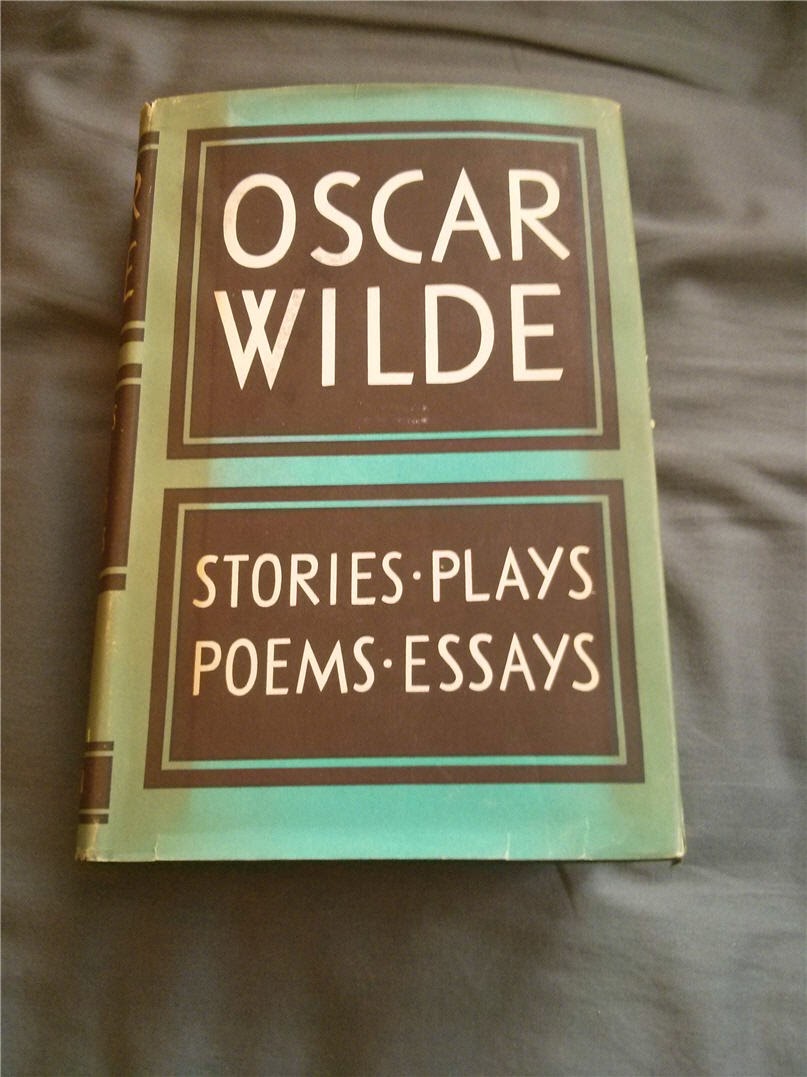
Design styles of the 50's.

Everything you would want to keep you occupied for a week.

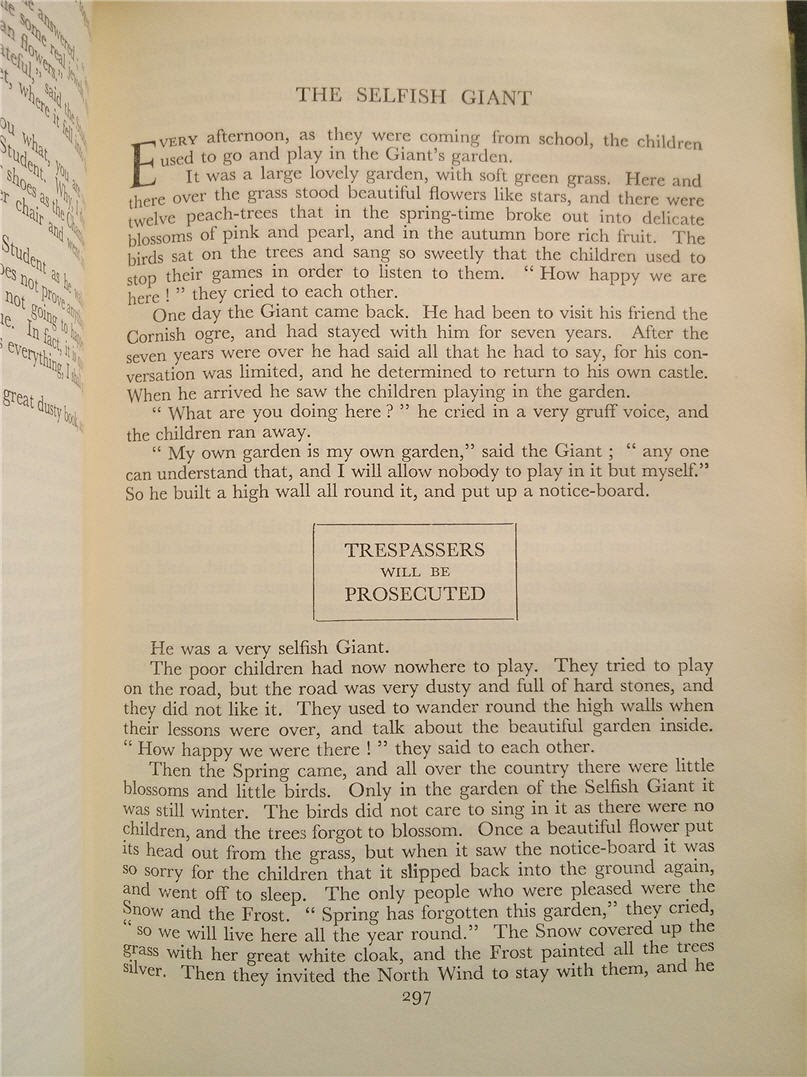
Known mainly for his plays and one novel (The Picture of Dorian Gray), I actually enjoy his short stories the most and have up until recently kept this book at work to leave through whenever I needed a break. Of all the works, I think ‘The Selfish Giant’ and ‘The Nightingale and the Rose’ resonate the most with me.

Simple yet deep.

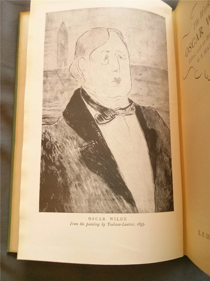
Unfortunately there is only one illustration in the book, the black and white plate of Oscar Wilde by Toulouse-Lautrec pictured above, but the inclusion of minor works like the essays and letters make up for the lack of visuals.

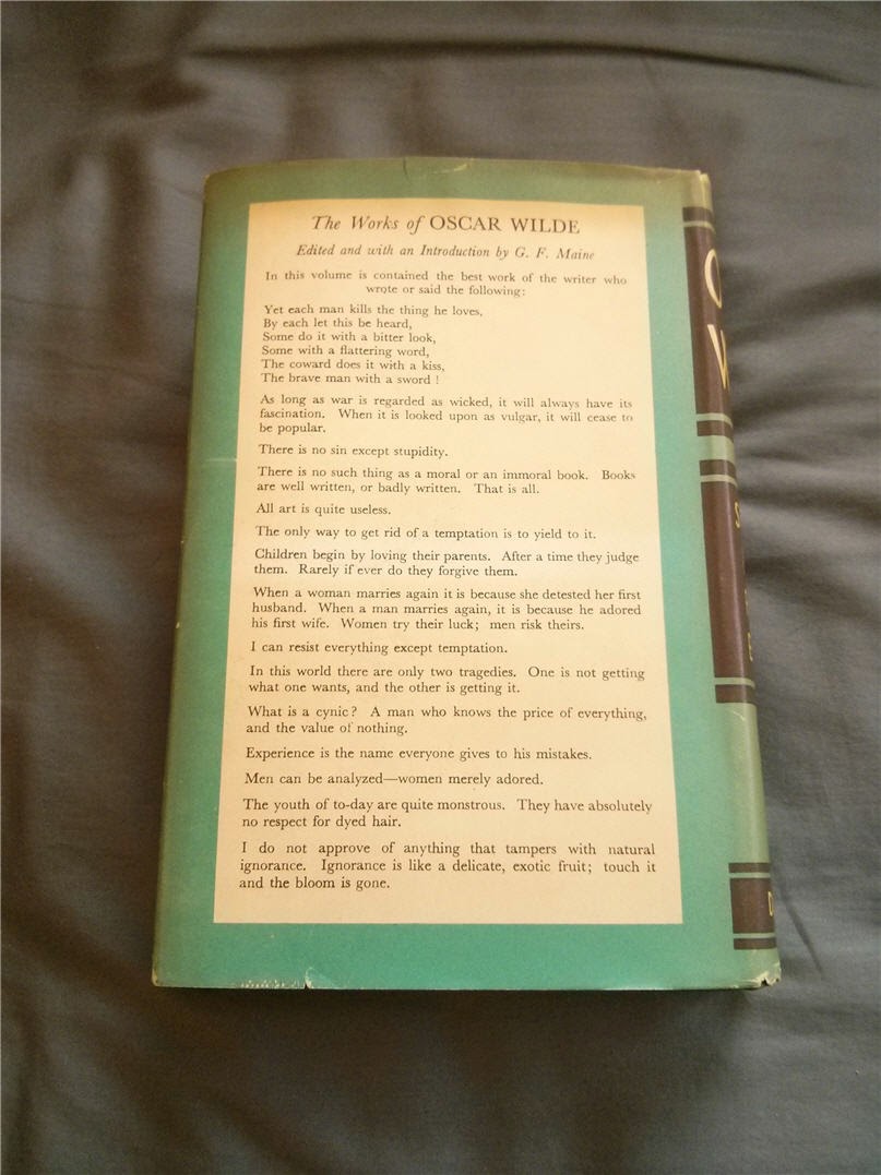
"There is no sin except stupidity" would make a great tattoo.

The second Oscar Wilde book I picked up was one of those treasures that if it had not been put out when I was in the shop it would’ve 
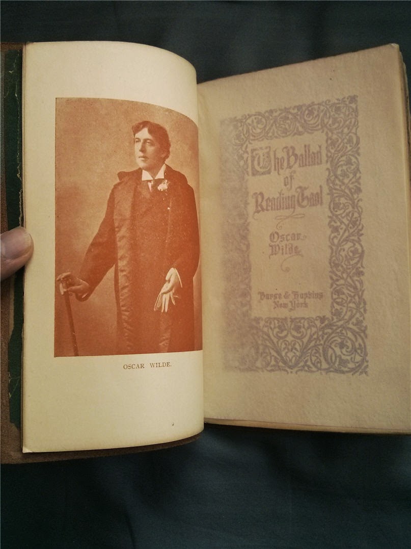
been snapped up before I even had the chance to see it. It is the Ballad of Reading Goal published by a small artisan press circa the 1910’s

Made by little book elves at the turn of the century.

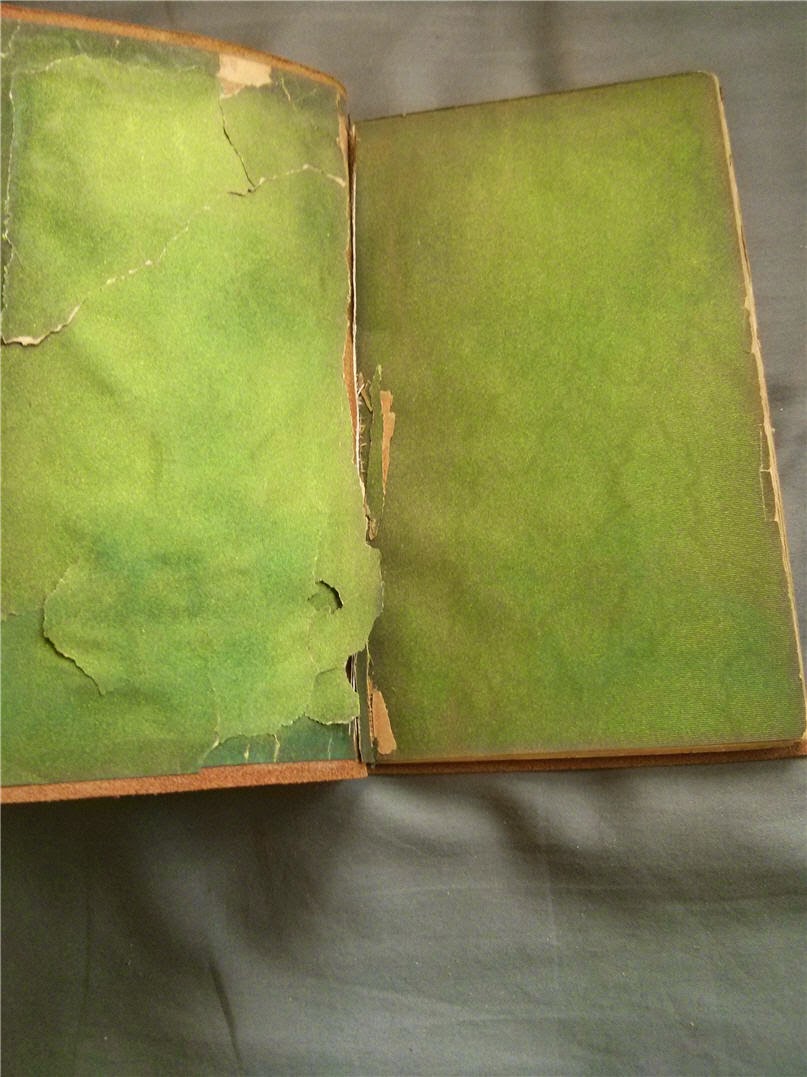
Gorgeous even in deterioration.

Everything from the embossed soft leather cover to the deckle edges to the gilding on the front and top edges, it screams craftsmanship. The book is definitely showing its age, with the iridescent inner cover sheets cracking but the thick cut paper makes this a joy to hold and read.

Dapper in many ways.

The texture of the paper turns me on more than it really should.

At only 30 pages it's a tiny book but contains a lot of character. Funny enough, the last page is still uncut, which I feel has some symbolic meaning somewhere. That or the guy making it missed a page.
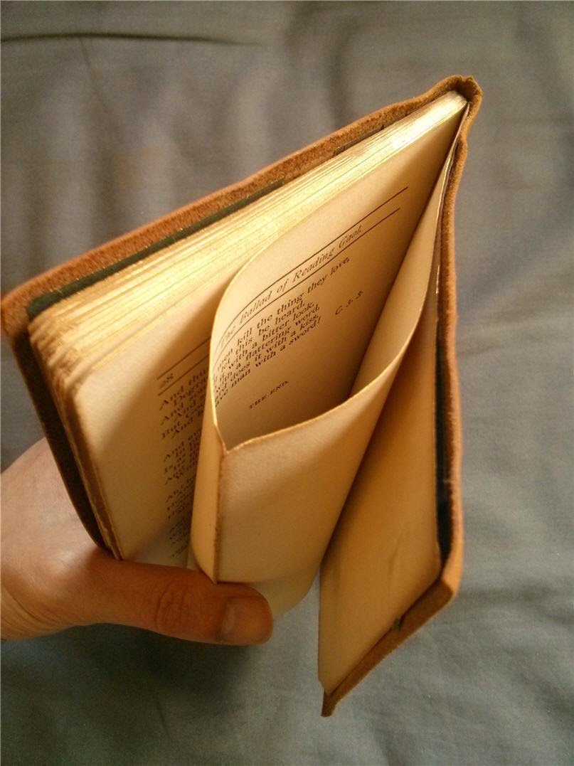
The end. Or is it?
Drink lots, be happy, and enjoy the lack of snakes in your home country if it happens to be Ireland.

Monday, March 10, 2014

S6: Guinness Book of World Records

The range of books coming out of the Biblio-Mat has really ranged in the last few months, which leads to this week’s hodge-podge blast from the past:

Baby blue and orange is a lost colour scheme.

Title: Guinness Book of World Records

Published in 1972, it’s simply titled Guinness Book of World Records and appears to be the 11th revision of it since 1960. Compiled by Norris and Ross McWhirter, it’s a solid 639 pages that no doubt became a staple of bathroom readers for many years. 

Also functions well as a brick.

As a kid, The Guinness Book of World Records was the defacto trivia book that always fascinated me in elementary school. As an adult, it still fascinates me that it just raked in so much coin year after year by adding a few new pages and updating a bunch of records. From what I remember, it actually holds two records – one for the best-selling copyrighted book (take that!, King James Bible), and the book most stolen from libraries. Hooray for marketing!

Hrm, their current site lists the largest baby at 23 pounds...

In terms of volume, would be dwarfed by some SUVs.

Really, outside of it being in hardcover and having only two colours on the cover it’s essentially the same book I picked up in the Grade 4 bookfair that I started and never finished. It’s amazing to see that it survived relatively in the same unchanged format into the 90’s before it evolved into the gimmicky hardcovers of the 2000’s. What a lucrative racket!

This record no longer stan-- oh wait.
303 feet, 6 inches. You're welcome.

As a huge fan of trivia, I definitely appreciate this book. As an even bigger fan of winning on pub trivia nights, I will definitely not be memorizing any of the outdated facts inside. Pretty cool to have this piece of record-keeping history on the shelf, though.  

Monday, March 3, 2014

OT4: Men of Canada

Stephen Fowler, the proprietor of the Monkey’s Paw, currently has an art piece exhibiting at the 26 art space centering around a set of old books, so of course I went to check it out.

The forefathers of our country?

Without giving too much away, this multimedia exhibit stems from a set of anthologies titled “Men of Canada” dating from the late 1800’s which was not unlike a giant yearbook for distinguished men of the Dominion. 

Does not highlight how thick these books were.

Pairing carefully extracted photographs and one-line bios taken out of context (one of my favourite things to do) with an original score, it’s an entertaining look at the upper society men of our great country a century and a half ago. It’s okay to laugh.  

Who doesn't love logic like that?

The whole piece is only 12 minutes long and runs on repeat cycling through five categories. I found myself sitting through multiple times out of fascination, and partly because I don't know why I was so amused by the poor guy who became distinguished by losing everything in a fire.

I know, I'm a terrible person.

The books themselves were also on display and the covers were simply gorgeous.

Design principles in the 1800's.

There's also method to the madness of how the categories were organized. It becomes pretty clear early on if you like to judge people like I do, otherwise you might need a second viewing.

The face of justice.

“Men of Canada” will be playing continuously for the next three Saturdays at the 26 art space at

26 Mackenzie Crescent (a block or so from the Monkey's Paw) from 2-6pm. If you like old-timey photos and quirky facial hair, go check it out.